Weekly Data Viz Decomp: The Guardian’s Premier League Transfer Window Summer 2016

Weekly data visualization decomps to keep a look out for technique and learning.

This week’s viz: Premier League: transfer window summer 2016 – interactive

Decomposition of a Visualization:

  • What are the:
    • Variables (Data points, where they are, and how they’re represented):
      • Bubble size for size of transfer
      • Color hue denoting transfer or out of team
      • Position for date close to transfer window
    • Data Types (Quantitative, Qualitative, Categorical, Continuous, etc.):
      • Qualitative and categorial
    • Encodings (Shape, Color, Position, etc.):
      • Shape, position, size, color hue
  • What works well here?
    • Showing a small multiples type view for each team and their transfers
  • What does not work well and what would I improve?
    • Having the totals summary numbers on the side of the charts is a little unorthodox and unintuitive
    • Bubbles seem to be placed arbitrarily without thought to the y-axis, even though the x-axis has meaning
    • Not immediately clear why some players are featured and noted in tooltips versus those that are not
  • What is the data source?  Do I see any problems with how it’s cited/used
    • Seems to be original Guardian data collected about the English Premier League, but not as clearly stated as I’d like to expect
  • Any other comments about what I learned?
    • Example of something pleasing to the eye in terms of color hue and perhaps some flash factor, but perhaps not that functional to explore upon closer examination.
      • Certainly sense for the purposes of the Guardian though in putting out this story and is a technique I’d borrow if I had a use case
      • Good for showing a bigger picture view
    • Probably not worth it in terms of the work it would be taken incrementally as filters are difficult to work and can be computationally expensive, but the nerd in me would have liked to search for the player

Weekly Data Viz Decomp: Your City’s Kickstarter Scene Visualized

Starting off with these weekly to keep a look out for technique and learning.

This week’s viz: Your City’s Kickstarter Scene Visualized

Decomposition of a Visualization:

  • What are the:
    • Variables (Data points, where they are, and how they’re represented):
      • Cities and founding for Kickstarter projected, shown in packed bubbles
      • Barchart breakout breakout with heat using color hue categorized in a data table
    • Data Types (Quantitative, Qualitative, Categorical, Continuous, etc.):
      • Quantitative
    • Encodings (Shape, Color, Position, etc.):
      • Shape, position, size, color hue
  • What works well here?
    • Showing size of funding relative to each other in a large scope, used with the size of the bubbles for individual projects in each city and the packed bubble sizes comparing city to city
  • What does not work well and what would I improve?
    • Would want to be able to filter more, by number of backers for instance to improve explorability and hide the bubbles
  • What is the data source?  Do I see any problems with how it’s cited/used?
    • Kickstarter data, straight from the source
  • Any other comments about what I learned?
    • Good example of a lot of data put into one place to be compared with relative ease
    • The analysis the goes with it is critical because most viewers will not spend enough time to do the analysis themselves to glean the ton of insight here


More MLS 2015 Visual Exploration Tools

mlsmore.PNG

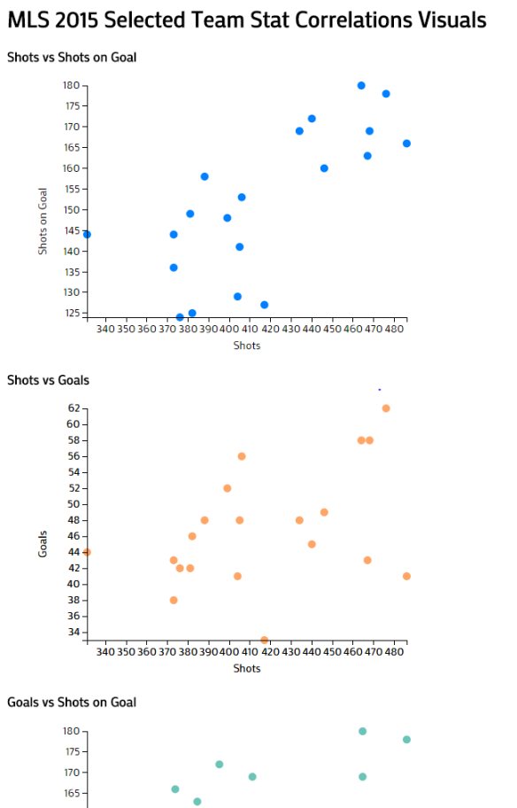
Previously, I created an interactive view just looking at goal breakdowns by Major League Soccer teams overall for the 2015 season.  I’ve added several more frames to look at the breakdown of the same dataset to this new view in a exploratory way to see variables that correspond or not.

MOTIVATION

As per verbatim from my previous post:

I’ve really into soccer in general, especially international play, after my grad school project where I worked at the Annenberg Innovation Lab collaborating with Havas Sports and Entertainment and IBM on a research project studying soccer fans (see Fans.Passions.Brands, Fan Favorites, and Sports Fan Engagement Dashboard). I also did my degree practicum on Marketing to Female Sports Fans.

I’m now in another universe creating data visualization at an advertising agency and am trying to combine the geeky fandom with practical practice related to my daily work.


DESIGN

I deliberately tried to use Tableau components and styling that was out of the ordinary, to some mixed level of success.  I put in a custom color palette in the Tableau repository preferences file.  Also, I tried to take advantage of using the context filters (when you click on one bar graph of a team for example, the other charts only show stats about that team you just click on instantly), scale filters, and pivoting the data on the third dimension, using both a color gradient and size of a value in a chart for instance.

TECH

Trying to stretch the design and exploratory strengths of Tableau here.  The one knock I give for Tableau in 2016 is that it doesn’t present data in a sexy enough way compared to Javascript-based visuals.  On the other hand, none of the Javascript based tools democratizes creating views you can explore with some pretty heavy statistical tools, one could some of the basic functions many people use SPSS for could be better left using Tableau as one integrated tool.  In particular, I utilized the r-squared and p-values to show correlations across different metrics that might matter or be interesting to see how they hold to some teams or not.  There’s not much of correlation between Corner Kicks and Goals for teams overall for instance, but there is greater negative correlation for those teams who have more losses.

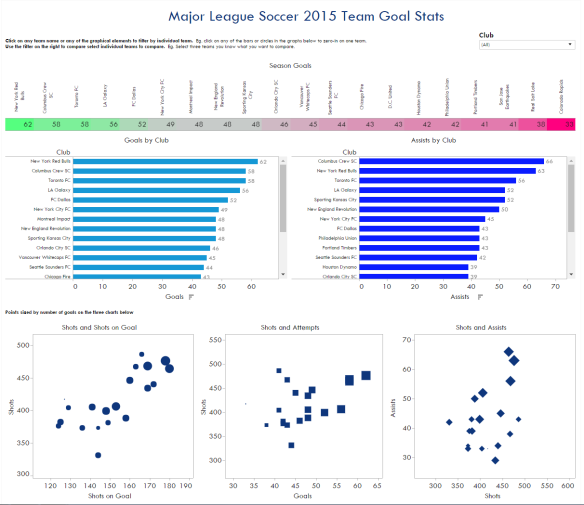
Major League Soccer 2015 Team Goal Stats


 mlsgoals_083116.PNG

First go at this dataset.  I created an interactive dashboard-like view just looking at goal breakdowns by Major League Soccer teams overall for the 2015 season.  Planning to add several views to this panel with the data.

Motivation

As per verbatim from my previous post:

I’ve really into soccer in general, especially international play, after my grad school project where I worked at the Annenberg Innovation Lab collaborating with Havas Sports and Entertainment and IBM on a research project studying soccer fans (see Fans.Passions.Brands, Fan Favorites, and Sports Fan Engagement Dashboard). I also did my degree practicum on Marketing to Female Sports Fans.

I’m now in another universe creating data visualization at an advertising agency and am trying to combine the geeky fandom with practical practice related to my daily work.

On that note, most of the statistics and visuals I’ve found through a just a cursory look are about wins and losses.  I’m trying to show goal data by team in the MLS in a way that looks at performance based on other factors such as number of attempts and assists and not just the win-loss-draw type metrics I found in most of the soccer sites I saw.

Design

I deliberately tried to use Tableau components and styling that was out of the out-of-the box template for the platform to emphasize the ability to size values on an additional data dimension. For instance, sizing each bubble based on number of goals or customizing labels out of the default. I notice a lot of users of Tableau don’t deviate much from the standard template, and I’m trying to train myself to go beyond that and also get better at the aesthetic piece of data viz.

Tech

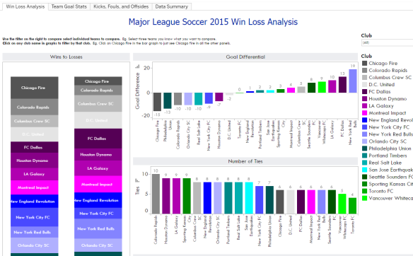
I use Tableau at work on a daily basis. I personally think where Tableau shines is its exploratory data capabilities if you know how to prepare data in a form usable in Tableau. A few years ago, its explanatory data visualization capabilities were second to none in this space, but the desktop tool has lost some flash factor to D3 and HTML5 visuals, but definitely not substance in my opinion. Plan to expand on this with win-loss figures as well as analysis of kicks as the high number of goals by team didn’t necessarily line up with number of matches won.

Network Visualization of Soccer Confederations of the Americas

collapsiblenetwork.PNG

Made with D3.js based on Mike Bostock’s Collapsible Force Layout. Used data from the CONCACAF (The Confederation of North, Central America and Caribbean Association Football) and CONMNEBOL (The South American Football Confederation) Wikipedia pages.  Click here or on screenshot above for interactive version on bl.ocks.

Motivation

I’ve really into soccer in general, especially international play, after my grad school project where I worked at the Annenberg Innovation Lab collaborating with Havas Sports and Entertainment and IBM on a research project studying soccer fans (see Fans.Passions.Brands, Fan Favorites, and Sports Fan Engagement Dashboard). I also did my degree practicum on Marketing to Female Sports Fans.

I’m now in another universe creating data visualization at an advertising agency and am trying to combine the geeky fandom with practical practice related to my daily work.

Design Notes

More trying to test out creating a network visual more than anything.  Kept it clean and minimalist with proper use of color hue differences.  Used a sans serif Google Font I found to keep it more modern and have it look a little different from the default web fonts.

Technology Notes

The whole point of this exercise was practice using the D3 Network layout.

  • Event handlers aren’t perfect. I wanted the leaf nodes to be able to collapse and also for all nodes to be dragged and placed.  Doesn’t work quite as seamlessly as I want, eg. you have to double-click nodes to un-snap from their position, which means collapsing those nodes that are able to be collapsed as well even if you don’t necessarily need to do that.
  • It also took awhile to get the repulsion and link length measures set so all the countries could be displayed in a less messy manner.

Next Steps

I want to create a network with all the countries of the FIFA Confederations and size the nodes by some measure indicating the size of the confederation. I’d also like to replace the leaf nodes for reach country with their country flags.

After 180 Days of Data Viz Learning #jfdi #dataviz #done

I noticed this when I logged into my WordPress account and realized I really need to do this debrief now that I’ve more than properly decompressed and feel a surge from inspiration from attending the OpenVis Conf.

afterlearning.png

A summary of what I did:

I read:

  • The Functional Art by Alberto Cairo
  • The Visual Display of Quantitative Information by Edward Tufte
  • Data Points Visualization That Means Something by Nathan Yau
  • Visualize This: The Flowing Data Guide to Design, Visualization, and Statistics by Nathan Yau
  • The Wall Street Journal Guide to Information Graphics by Dona M. Wong
  • The Best American Infographics 2014 by Gareth Cook
  • Show Me The Numbers by Stephen Few

2016-03-21 09.13.12.jpg

I studied:

  • Knight Center Course on D3.js and Data Visualization
  • Treehouse D3 Course
  • Data Visualization and D3.js on Udacity

I coded/created:

  • Tableau business dashboards on digital marketing attribution, including customized DMA maps, etc that are beyond the typical drag and drop.
  • D3 scatterplots, scatterplot matrixes, node link trees, hierarchal force layouts, sankey, bar charts, bubble charts, sunbursts, histograms, and even pie chart

I accomplished:

  • Gaining a design sensibility for data visualization
  • Understanding data connections and issues around them (eg. Vertica, Cubes, SQL, S3, etc.)
  • Solid foundation of D3
  • Strong skills in Tableau
  • Conceptual understanding of visualization suites in general, such as R libraries, other Javascript libraries, and other Enterprise BI tools (Quikview, Power BI)
  • Being the thought leader in data visualization in my organization

To take a step back, I embarked on this journey because I got new role with the job title as Data Visualization Manager.  I talked about this in my first post and embarked on 180 Days of Data Viz Learning as inspired by Jennifer Dewalt’s Project 180 Websites in 180 Days.  It’s been a journey with highs and lows, good, bad, and ugly.  I walked away with a strong design and business sensibility, new hard skills and knowledge, and an understanding of data visualization at the both an enterprise and the open source level.  

Creating a Design, Business Intelligence, and Product Sensibility

One big thing I set out on as a differentiator was that I didn’t just want to learn to code or just be able to make pretty visualizations.  There are many people who can code better than me and will always be able to code better than me.  There are also many people who can make much more beautiful visuals than me.  I’m not naturally inclined toward art or to computer science in terms of innate talent or passion, but I recognize the importance of bridging those two disciplines would be for this endeavor in my career.  For me, I don’t consider coding my passion.  I’m also no designer or artist.  I’ve never considered myself in the “creatives.” I consider communication and storytelling as my passion, and code is a means to construct that narrative.  Being a bridger of ideas and practices is a number one priority in my life.

The Good

The process really forced me to learn and focus, even if in the end it took far longer than 180 Days, roughly seven months.  Not bad I think considering I did go on two overseas vacations and did a cross country move during that time.  I sincerely think I would not have gotten so much done had I not felt compelled to do some work everyday.  

For my own practical purposes as the “bridger.” I wanted to make sure I had a strong background on design concepts related to data visualization and also how gain a proficiency in the tools required for my role.  Tying that all together is what I wanted to develop out as a strength.  I can talk intelligently about how performance issues in a dashboard can be influenced by projections in HP Vertica or how the data needs to be prepared in a Hadoop cluster first and then how to query it into the right format for a visualization.  I can talk visual encodings and perception from a design perspective, the grammar of graphics and all that.  And I can talk about the strengths and weakness of Tableau/other enterprise tools and what libraries we can use to scale D3.  I can talk about these things, and I slowly get better at doing these things everyday.

Doing a little bit of these things everyday really pushed me in a way I don’t think I would have.  Sometimes it just ended up being five minutes of extra reading at night to five hour work sessions.  Ironically doing the 180 Days had a great side effect in making me aware of a larger strategic view at my work that I realize I lost when I stopped.  I also inadvertently lost 10 lbs and started reading more everyday because this whole endeavor made me much more mindful.

The Bad:

Learning theory and application at once isn’t easy from a motivational perspective.  I’m the only person working with Open Source tools and doing data visualization beyond a dashboard or business analyst (eg excel type) graphs perspective, but I had to do a lot of that in my day-to-day as well.  It can really grind on you reading and seeing beautiful visualization and then taking over ten hours to do a successful visualization in D3.  Prepare for that.

There’s a flipside in doing something everyday, in that by having to do a little bit everyday, it can become a quantity over quality game.  I had more nights that ended up later than I wanted because I rushed to read and learn before going to bed.  It might have made more sense on some days to just do a longer block to focus than try to something EVERY DAY.  I’m trying to learn Javascript and Front-End in general now along with a couple of other topics in my life, and I’m not going about the same way I did with the 180 Days of Data Viz Learning.

Lessons Learned and Tips

  1. Really go for easy wins if you do try to get in some work everyday.  My main goal was to have three takeaways for every lecture session where I was watching videos online or from reading I did that day to absorb the information.  Decomposing visuals was especially helpful and is a good process to learn when you need to turn the tables on your own.
  2. Find partners in your journey.  Up until the OpenVisConf last week, I had no barometer to measure to see how much I knew and learned.  I got down on myself more often than I needed to given how much I did learn and all the balls I had in the air at once.  Having a support group/sounding board would have made the journey better and I would have learned more.
  3. It was hard to learn theory and application at once – mainly because you’ll be making so little progress at first.  It was a bummer and is still a bummer to see how far I am from being able to do the work of people I admire.  Also, unlike other skills I have (eg. I’ve been doing advertising and project management for years), Data Ziz is still new.  I have bigger ambitions than what I can make, and that is reality and that is ok, but it’s hard to accept sometimes.  Maybe this is a mental thing for me, but mentioning it as I’m sure it’s something someone else may run into in their process.
  4. Procrastination is normal.  Figure out if you’re tired out/burned out or else just annoyed and anxious.  If annoyed and anxious, just try working for five minutes.  If you can keep working, chances are you aren’t tired or burned out and have some internal dialogue to work through or some process to improve on.
  5. Data Viz Burn out.  It can happen, and I definitely felt that way, which is why I actually advise against the 180 days straight versus working on a few projects concurrently and going through books and tutorials in a more paced versus trying to pick up bits and pieces everyday.  Also, I got to the point where I was doing Data Viz at work and going home to do more Data Viz, that I got to a point where didn’t like something I enjoyed anymore.  Also, on this note, take  time to just enjoy other Data Viz projects too like a regular audience would, rather than doing critique or learning.  Burnout is normal, rest accordingly.
  6. Don’t give up!  I didn’t get where I wanted to in terms of a creative or technical skillset that I had hoped for after a 180 days and even now, but I did progress significantly in what I know and enjoyed the journey.

 

Day 180 of 180 Days of Data Viz Learning #jfdi #done #dataviz

I’m doing some form of data visualization learning for 180 days because I need to #JFDI.

See post explaining how and why I’m doing this.

Guess what?  It took longer than 180 days, but it’s been a pretty cool journey.  Did my daily learning will post a debrief early next week.  This has been quite the intellectual and emotional exercise for me.  Learned so much about data viz + more.

Eljiah Meeks D3.js in Action

Chapter 5 Layouts
Some last takeaways
  • One key with generators eg. d3.svg.arc is that they have particular settings p 144
  • “One of the core uses of a layout in D3 is to update the graphical chart. All we need to do is make changes to the data or layout and then rebind the data to the existing graphical elements” p 146
  • If transitions are distorted because of default data-binding keys, you may need to change sorts, eg pieChart.sort(null); in conjunction with exit and update behavior p 147
  • Layouts in D3 expect a default representation of data,  usually a JSON object array where the child elements in a hierarchy are stored in child attribute that points to an array.  p 149
  • You can either data munge or get use to using accessor functions p 149
  • Pack layouts have a built-in .padding() function to adjust spacing and a .value() function to size out spacing and influence size of parent nodes p 151

Reading and Learning Data Visualization Theoretically/Critically:

Show Me the Numbers by Stephen Few

Three Takeaways Today

Chapter 5 Visual Perception and Graphical Communication
  • “Our perception of space is primarily two dimension.  We perceive differences in vertical position (up and down) and in horizontal position (left and right) clearly and accurately. We also perceive a third dimension, depth, but not nearly as well.” p 71
  • “We perceive hues only as categorically different, not quantitatively different; one hue is not more or less than another, they’re just different.  In contrast, we perceive color intensity quantitatively, from low to high” p 71
  • Both size and color intensity are not the best way to code quantitative values.  The key is not good at matching a number to a relative size or color intensity -> use length or position if possible instead p 73

Day 179 of 180 Days of Data Viz Learning #jfdi #dataviz

I’m doing some form of data visualization learning for 180 days because I need to #JFDI.

See post explaining how and why I’m doing this.

Eljiah Meeks D3.js in Action

Chapter 5 Layouts

Three Takeways Today

  • Layouts are D3 functions that help format data so it can be used for select group of charting methods p 139
  • Layouts do not actually draw the data nor are they called like components or referred to in the drawing code like generations.  They’re actually a preprocessing step that formats data so it’s ready to be displayed in the form of the visual.  You can update layouts and if you rebind the altered data, you can use D3 enter/update/exit syntax. p 139
  • “Many people get who started with D3 think it’s a charting library, and that they’ll find a function like d3.layout.histogram that creates a bar chart in a <div> when it’s run.  But D3 layouts don’t result in charts; they result in the settings necessary for charts.  You have to put in a bit of extra work for charts, but you have enormous flexibility (as you’ll see in this and later chapters) that allows you to make diagrams and charts that you can’t find in other libraries” p 141

Day 178 of 180 Days of Data Viz Learning #jfdi #dataviz

I’m doing some form of data visualization learning for 180 days because I need to #JFDI.

See post explaining how and why I’m doing this.

Eljiah Meeks D3.js in Action

Chapter 4 General Charting Principles 

Three Takeways Today

// Callback function breakdowns

var n = 0 // counter to increment
for (x in data[0])
if (x != day) { //not drawing a line for day value of each object because this is giving x value of coordinate
var movieArea = d3.svg.area() // generator that iterates through each objet that corresponds to one of our movies using day vlaue for x coorindate but iterating through values for each movie for the y coordinates
.x(function(d) {
return xScale(d.day)
})
.y(function(d) {
return yScale(d,x))
})
.y0(function(d) {
return yScale(simpleStacking(d,x) – d[x])
})
}

// Stacking function. Takes incoming bound data and name of attr and loops throuhg the incoming data, adding each value until it reaches current named attribute. As a result, it returns the total value for every movie during this day up to the movie we’ve sent.

function simpleStacking(incomingData, incomingAttribute) {
var newHeight = 0
for (x in incomingData) {
if (x != “day”) {
newHeight += parseInt(incomingData[x]);
if (x == incomingAttribute) {
break;
}
}
}
return newHeight;
};
// Stacking function that alternates vertical position of area drawn p 136